Parametric Distributions#
Learning Objectives
Identify several parametric distributions and their properties.
Select parameters to align a parametric distribution to the observed histogram.
In section Sound Level Distribution we looked at the empirical distribution of the sound levels dataset through the lens of the histogram. Often (but not always) the distribution’s shape can be described by a function with a few parameters, and those parameters can have an interpretable meaning.
We will look at a segment of background sound from the Orcasound hydrophone network.
Reading Data#
!wget --no-check-certificate 'https://docs.google.com/uc?export=download&confirm=t&id=1466snzjsXPVTlKnzkkCkdOgwoO5Zvutq' -O background.wav
# import libraries
import matplotlib.pyplot as plt
import numpy as np
from IPython.display import Audio
Audio("background.wav", rate=48000)
from scipy.io import wavfile
# reading background data
samplerate, sound = wavfile.read('background.wav')
print("Sample rate: "+ str(samplerate))
Sample rate: 48000
Computing Sound Levels#
We will compute the (relative) sound levels for each segment of 0.1s:
we will split the signal into 0.1s segments
compute the Root Mean Squares of the signal
convert to dB values
# length of window in time
win_len = 0.1
# truncate the signal to be exact number of seconds
len_trunc = len(sound)-len(sound)%samplerate
# number of windows
n_win = len_trunc/samplerate/win_len
# split signal in n_win
sound_split = np.split(sound[:len_trunc], n_win)
# we calculate RMS for each window
RMS = [np.sqrt(np.mean(np.square(group.astype('float')))) for group in sound_split]
# convert to sound levels
sound_levels = 20*np.log10(RMS)
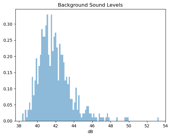
# visualize the histogram of the log values
h = plt.hist(sound_levels, bins=100, density=True, alpha=0.5)
_ = plt.title("Background Sound Levels")
_ = plt.xlabel("dB")
Note
The range of the levels are lower than what we would find in a dataset. The reason is that the hydrophone is not calibrated, hence these are relative levels. The true distribution will be shifted to the right. Here we focus on the shape of the distribution.
Normal Distribution#
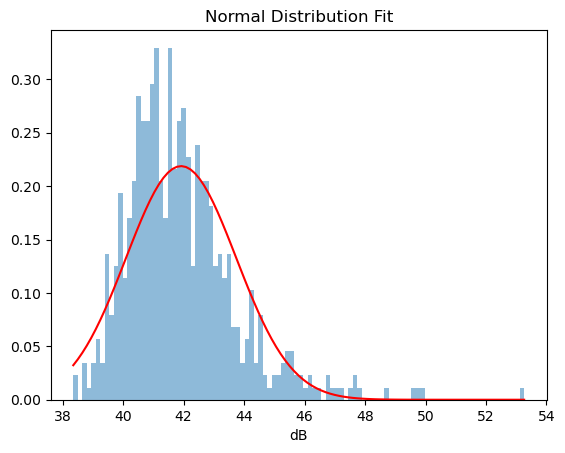
A popular example is the Normal (Gaussian) distribution, which is characterized by the bell curve and its mean and variance. In the context of ocean acoustics, we can assume that background noise (in the absence of distinct strong noise sources) follows normal distribution.
We observe that the histogram is not a “perfect” bell curve, partially because there are some sounds of waves. Regardless, let’s try to see how closely we can describe it with a normal distribution.
First, we will calculate the mean and the variance of the observations, and we will overlay the normal density curve with those parameters on the histogram.
mean = np.mean(sound_levels)
std = np.std(sound_levels)
import scipy.stats as stats
gaussian_density = stats.norm.pdf(h[1], loc=mean, scale=std)
# visualize the histogram of the log values
h = plt.hist(sound_levels, bins=100, density=True, alpha=0.5)
_ = plt.plot(h[1], gaussian_density, 'r')
_ = plt.title("Normal Distribution Fit")
_ = plt.xlabel("dB")
Skew Normal Distribution#
It is obvious that the distribution of the sound levels is not symmetric. The right tail corresponds to the rare louder events. Skew normal distribution is an example of a distribution which has a parameter called “shape” which introduces skew to the distribution. If it is positive, it is skewed to the right; if it is negative it is skewed to the left, and zero corresponds to normal distribution.
# construct the density with a shape parameter a=2
skewnormal_density = stats.skewnorm.pdf(h[1], a=2, scale=std, loc=mean)
h = plt.hist(sound_levels, bins=100, density=True, alpha=0.5)
plt.title("Skew Normal Distribution Fit")
_ = plt.plot(h[1], skewnormal_density, color="orange", label="Skew-normal")
_ = plt.plot(h[1], gaussian_density, 'r', label="Normal")
_ = plt.legend()
_ = plt.xlabel("dB")
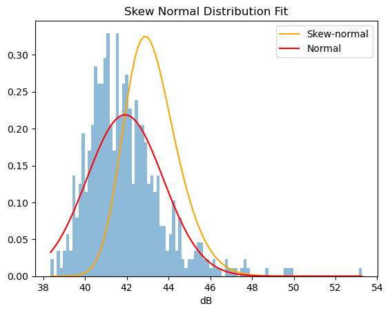
We can see that the shape of this distribution is slightly skewed to the right but still does not fit quite right.
Fitting A Distribution#
While for a distribution like the normal distribution it is intuitive to understand that the sample mean and standard deviation can be used to select the right parameters for a Gaussian model, determining the parameters of the Skew Normal distribution can be more challenging.
If we have a substantially large sample from a distribution, we expect that the analytical distribution matches the empirical one. We expect that its probability density will be close to the outline of the histogram of the sample. Of course, we may need a very large sample to observe values in the tails of the distribution.
Skew-normal Parameter Fitting Widget#
We will demonstrate the effect of the parameters of the skew-normal distribution on its shape and how that can change the “fit” to empirical distribution. In the absence of other knowledge, we will start with a skew-normal distribution with zero shape, offset equal to the mean, and scale equal to the standard deviation, i.e. a normal distribution
Exercise
Manipulate the parameters to achieve a better fit.
You may have observed that it is not entirely straightforward to find a good fit. Simply increasing the shape parameter is not enough. It is not entirely clear whether to capture some of the values in the tail or in the peaks. In section Parameter Estimation we will discuss how to do this quantitatively and automatically.
Important
Why fit a parametric distribution?
Describe the distribution of many observations only with a few parameters
Calculate probability of certain events with an analytical function
Approximate values of interpretable parameters
Derive properties of the distribution
Compare changes in distribution
Other Distributions#
Cauchy Distribution#
The Cauchy distribution is popular example of a distribution which at first sight seems to have a “bell shape” similar to that of a normal distribution, however, its tails are “fatter”, i.e. events in those tails are more common to occur than events in the tails of the normal distribution. While the normal distribution can be described by its mean and standard deviation, the Cauchy distribution is a pathological example of a distribution without finite expected value and variance.
The Cauchy distribution instead can be described by its median and the interquartile range (the range corresponding to the middle 50% of the observations).
cauchy_density = stats.cauchy.pdf(h[1],np.median(sound_levels), stats.iqr(sound_levels)/2)
# visualize the histogram of the log values
h = plt.hist(sound_levels, bins=100, density=True, alpha=0.5)
plt.plot(h[1], gaussian_density, 'r')
plt.plot(h[1], cauchy_density, 'g')
[<matplotlib.lines.Line2D at 0x3169dfe00>]
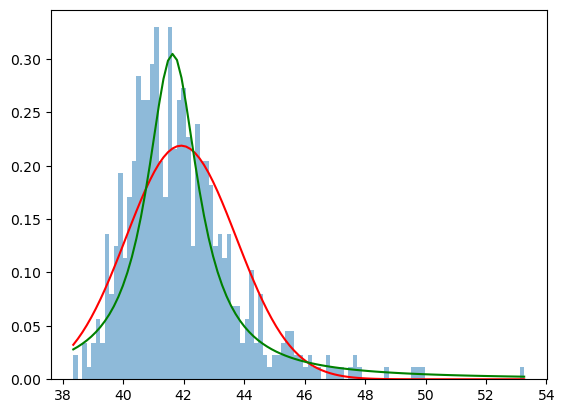
We can see that the right-hand-side tail is higher than the tail of the normal distribution and in this case seems to better capture the outliers (which in this case correspond to louder events in comparison to ambient noise).
Logistic Distribution#
Logistic distribution is another example of a distribution with thicker tails, however, it has better properties: its mean and variance are finite. It can be described by its mean and scale \((\sqrt{3}std/\pi )\).
import math
logistic_density = stats.logistic.pdf(h[1], mean, std/math.pi*math.sqrt(3))
# visualize the histogram of the log values
h = plt.hist(sound_levels, bins=100, density=True, alpha=0.5)
plt.plot(h[1], gaussian_density, 'r')
plt.plot(h[1], cauchy_density, 'g')
plt.plot(h[1], logistic_density, 'y')
plt.legend(["Gaussian", "Cauchy", "Logistic"])
<matplotlib.legend.Legend at 0x316a4f740>
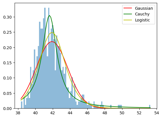
The tails are just slightly higher than the tails of the normal distribution, but it overal captures more of the cental data.
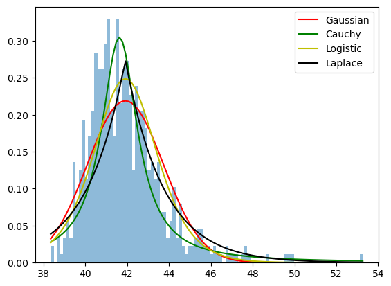
Laplace Distribution#
Yet another example of a symmetric distribution is Laplace. Laplace distribution is characterized by a sharper peak.
laplace_density = stats.laplace.pdf(h[1], loc=mean, scale=std)
# visualize the histogram of the log values
h = plt.hist(sound_levels, bins=100, density=True, alpha=0.5)
plt.plot(h[1], gaussian_density, 'r')
plt.plot(h[1], cauchy_density, 'g')
plt.plot(h[1], logistic_density, 'y')
plt.plot(h[1], laplace_density, 'k')
plt.legend(["Gaussian", "Cauchy", "Logistic", "Laplace"])
<matplotlib.legend.Legend at 0x316bc60f0>
Gamma Distribution#
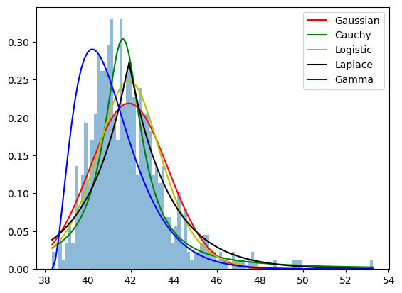
The left tail has cut-off threshold due to the properies of the hydrophone. We can describe this pattern with Gamma distribution which can have a non-symmetric shape.
There are several parameters which describe a Gamma distribution: shape, scale, and offset. The shape determines the skewness, and for that we need to estimate the sample skewness from the sample. Once the shape is known the sample mean and standard deviation can be used to estimate the offset and scale.
\(\alpha = \frac{4}{skeweness^2}\)
\(offset = \mu - \sigma \sqrt{\alpha}\)
\(scale = \frac{\sigma^2}{\mu - offset}\)
# calculate skewness
sk = stats.skew(sound_levels, bias=True)
# estimate parameters
a = 4/(sk**2)
offset = mean - std*np.sqrt(a)
offset = min(sound_levels)
scale = std**2/(mean - offset)
a = 3 #! set it to 4 as it looks a bit better
gamma_density = stats.gamma.pdf(h[1], a=a, scale=scale, loc=offset)
# visualize the histogram of the log values
h = plt.hist(sound_levels, bins=100, density=True, alpha=0.5)
plt.plot(h[1], gaussian_density, 'r')
plt.plot(h[1], cauchy_density, 'g')
plt.plot(h[1], logistic_density, 'y')
plt.plot(h[1], laplace_density, 'k')
plt.plot(h[1], gamma_density, 'b')
plt.legend(["Gaussian", "Cauchy", "Logistic", "Laplace", "Gamma"])
<matplotlib.legend.Legend at 0x316cf5a00>
Note
We can see that all these distributions fit the data to some extent but have:
varying sharpness of the peak
varying thickness of the tails
varying skewness
See also
Other popular distributions:
exponential: describing waiting times between events
Poisson: describing number of events
Mixture of Gaussians: multimodal distributions describing mixture of event types
Binomial/Multinomial: describing proportions
Dirichlet: describing distributions of histograms